Having a good balance in art is important!
 |
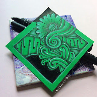
Doodling designs on darker paper can be intimidating. I decided to keep my zen doodle patterns simple in this piece so I could focus more on the shading imstead.
Shading Art can be sorta addictive
There are many different types of shading techniques. The fun of abstract art is I don't even pay much attention to a "light source" - it all just sort of works out in the end. :)
 |
| Before shading |
For this drawing, I shaded with a 4B pencil because the paper is so dark. I used a white charcoal pencil and a white gelly roll pen for highlights. Green is my favorite color so I am pretty happy with the turnout of this Zentangle!

This looks great. I haven't done much work on dark coloured papers but this inspires me to try. The fact that the highlights shine so brightly is a great bonus! Love the composition of this too!
ReplyDeleteWow, thank you for this comment! Yes, darker paper does lead to highlights looking more vibrant. That's what made me practice on this green cardstock. I still get intimidated on dark paper so I plan to keep at it!
Delete