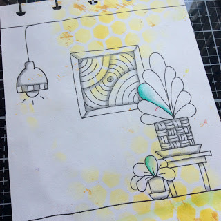
Zentangle designs add lots of interest
This Zentangle was so much fun. My husband said that it sort of looks like a 1970's era living room? Which doesn't surprise me that my imagination would create something resembling the '70s-'80s? I am still an '80s kid at heart. I always will be. I love everything '70s-'80s!
I started out this Zentangle tile with adding a touch of yellow distress ink through a honeycomb stencil by Tim Holtz. Most of my background papers are already premade and ready for when inspiration strikes. I knew I wanted something without too much color. I am always fond of yellow with black and white Zentangles. If you are afraid of adding color to your Zentangles, in my opinion you can't go wrong with a hint of yellow.
I couldn't stop with yellow though of course. lol
A work in progress picture of my Zentangle

I wanted to show that I decided to add a pop of green to my Zentangle and I think it worked well. I used watercolor pencils to achieve this. As you can see the watercolor added a bit more interest to my Zentangle artwork. Now looking at this as I blog about it, I feel like perhaps I should have added a little more color to the bottom "floor" as well? What do you think?


No comments:
Post a Comment